Front-O
The beauty is in the simplicity
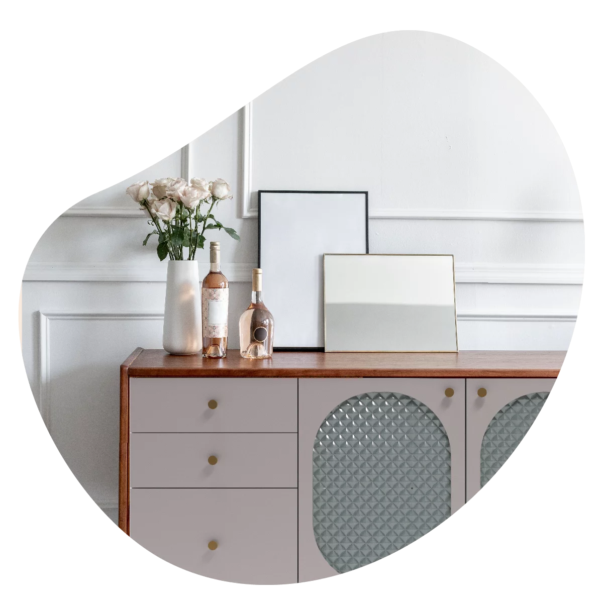
Fronto is a young furniture company that combines unusual design and modern technology.
The agency's task:
The Agency’s task was to create a visual identity for the brand, reflecting its character, build a website with a store module, and create 3D designs for cabinet fronts.
Where did we start?
Fronto is a fairly young but ambitious company planning its expansion in the European furniture market. To prepare her team for effective action, we began our work on the project by researching the competition – its communications and sales processes, business analysis of the market, and defining the target audience with which the brand would communicate.
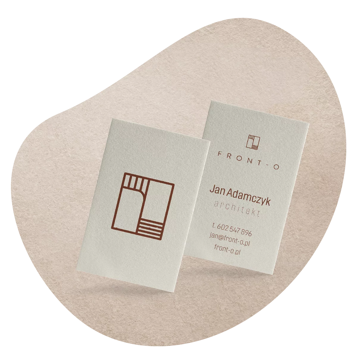
Logotype & branding
Beauty lies in simplicity, which is why the logo we created is minimalistic, slightly technical and subtle in its color scheme, referring to the natural materials of the product. We wanted the logo to reflect the brand’s modern approach to both design and manufacturing technology.
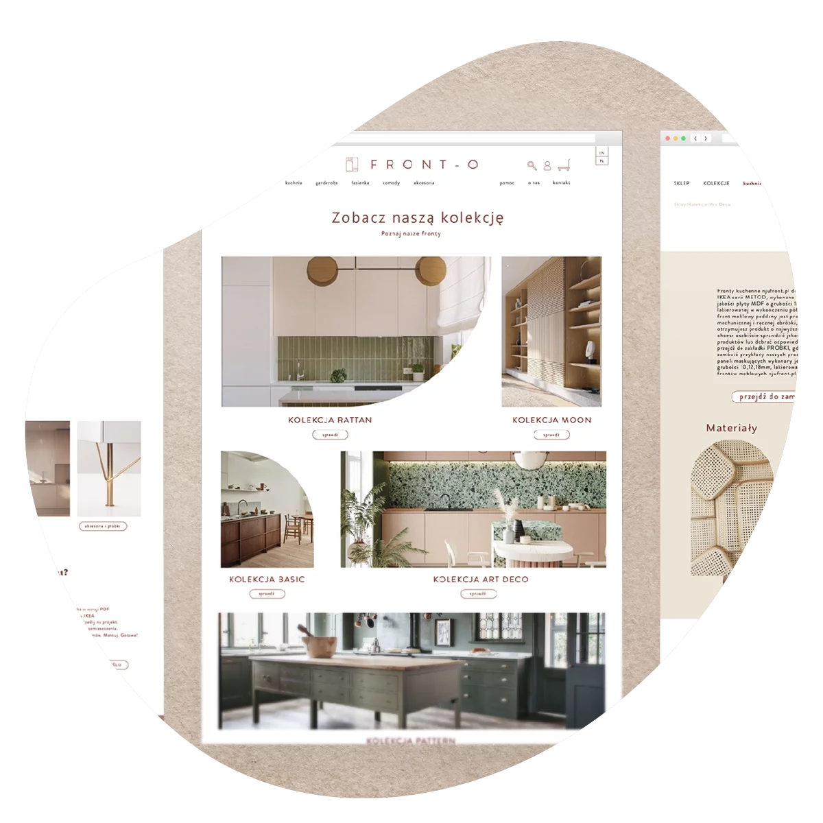
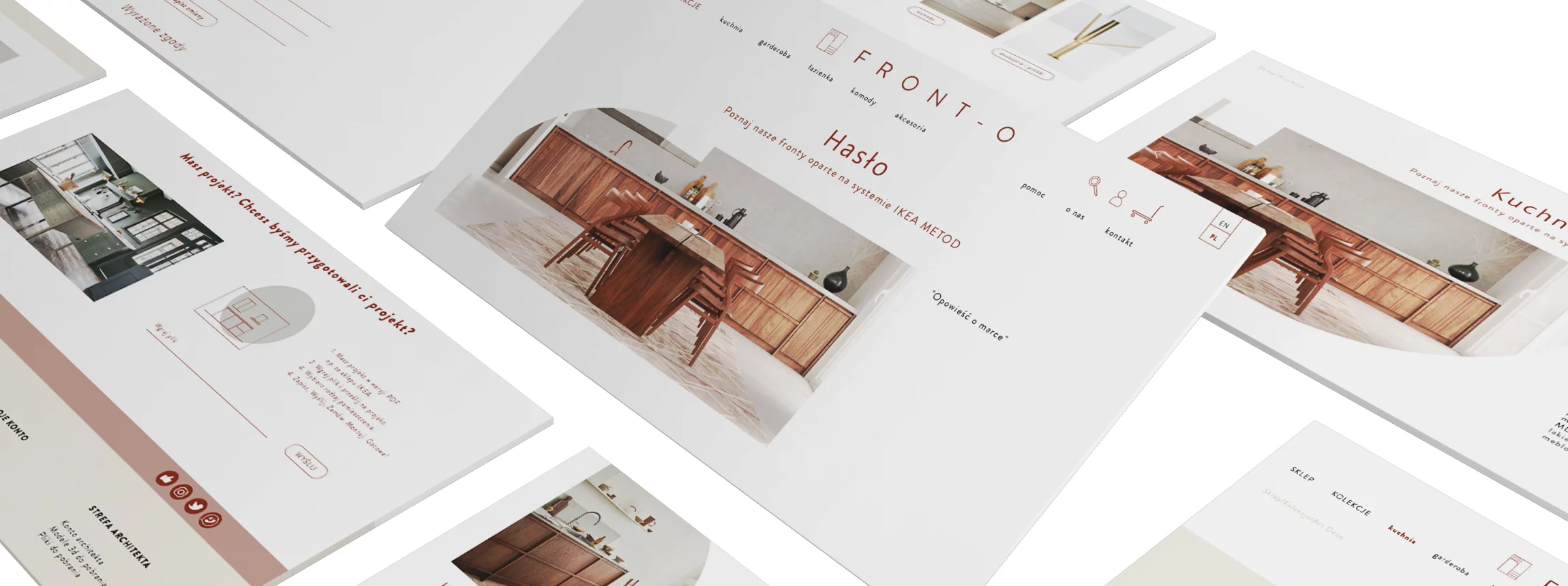
WWW
The creation of the website required us to make an in-depth business analysis of the furniture market. The client wanted customized UX solutions.
We went through each competitor’s ordering process and UX, eliminated what was imperfect, and created as simple and visually appealing a UX and product configurator as possible. The challenge was the huge number of parameters and variables and maintaining graphic aesthetics in the process.
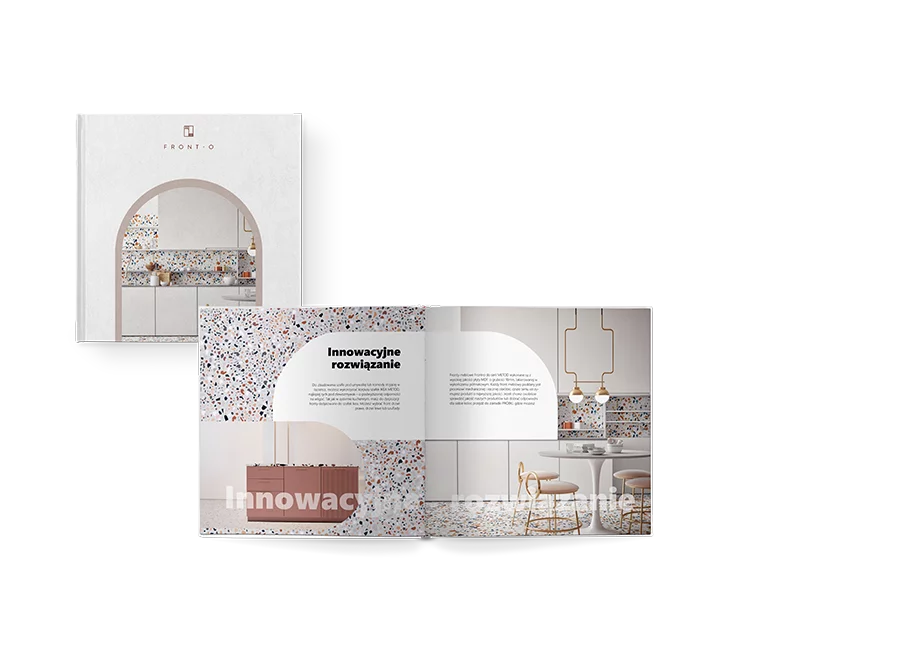
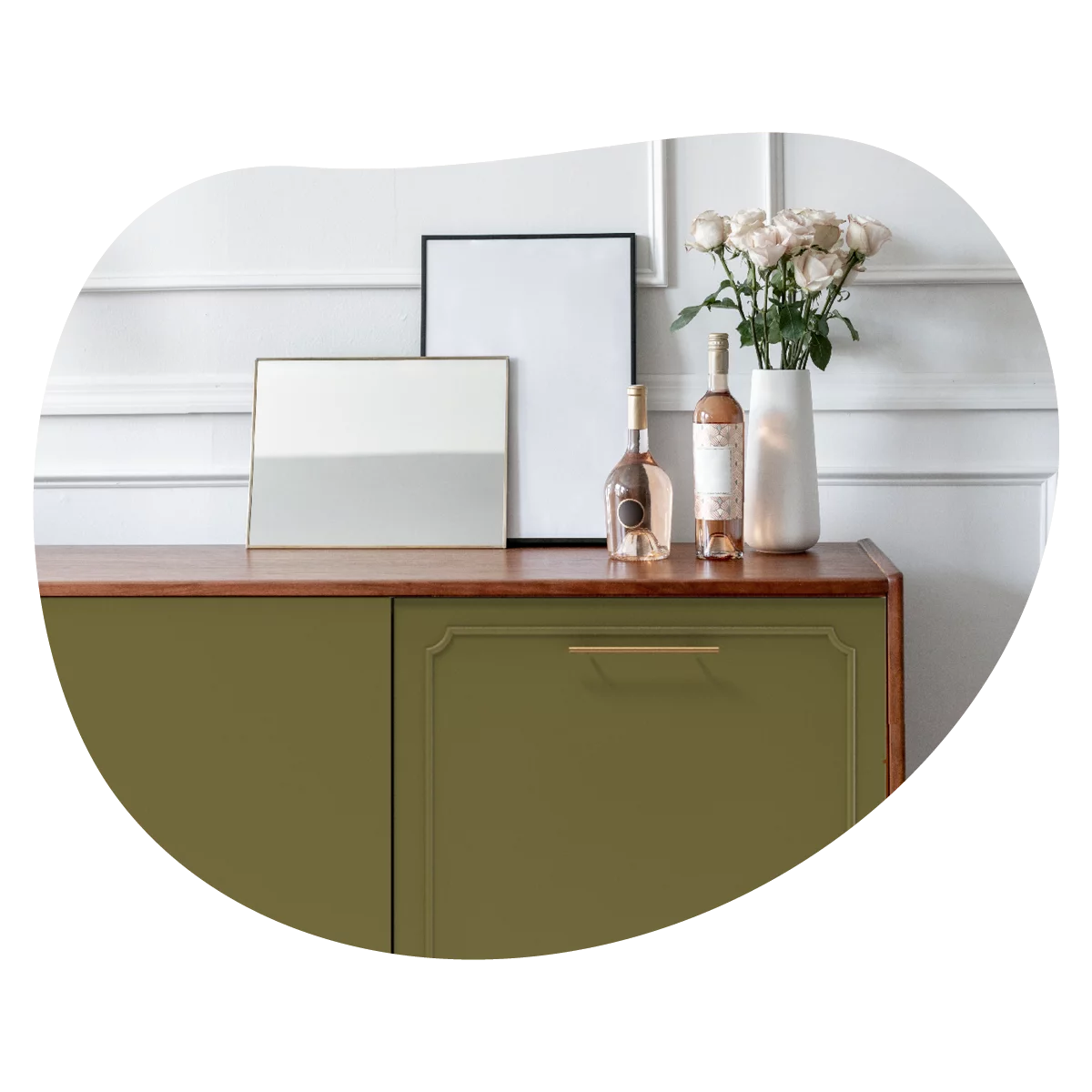
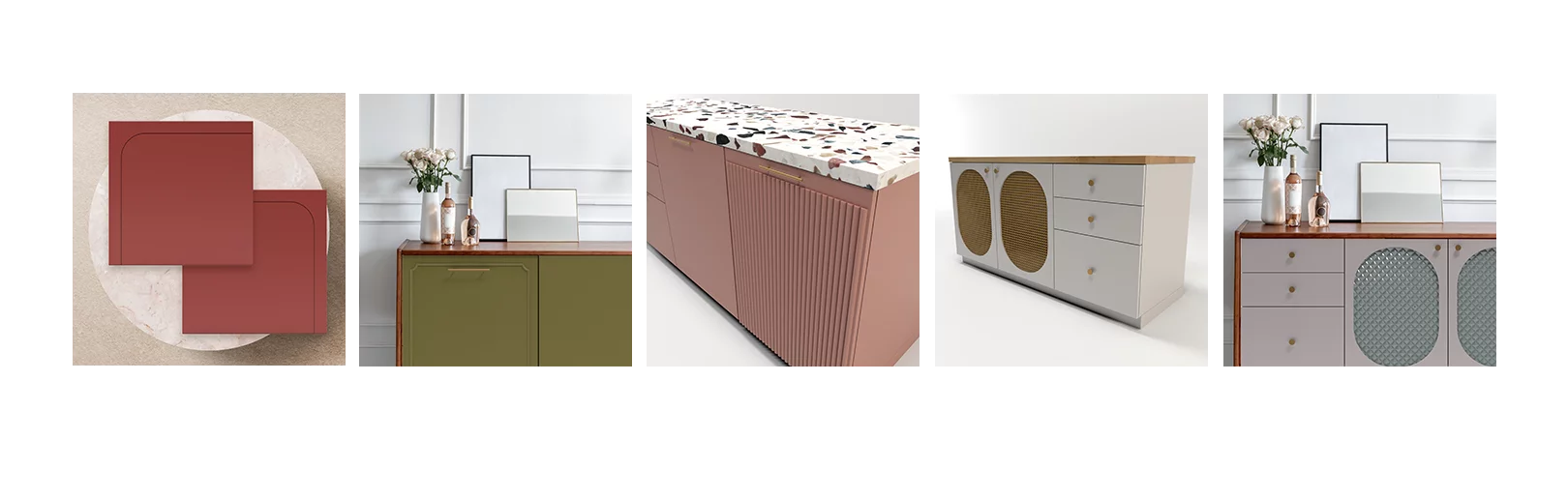
3D designs
Our tasks also included designing the fronts of the cabinets. Our 3D studio prepared a set of materials to support the architects. We made not only renderings of the cabinets themselves but also visualizations, showing the product in a finished arrangement.
Creative Answer was responsible for preparing the brand’s visual identity so that it could compete with players in the European market. The task was performed at the highest level, such as the quality of Front-O products themselves.

We deliver marketing campaigns and events for brands, supporting their business goals through effective actions and well-executed delivery. We combine measurable results with a high level of collaboration comfort.